Andrew Glenister, currently an analyst for GraphicMail, an international email service provider or ESP, kicked off the second 'third' of DMX conference speaker sessions. He said it's important to discuss various email options to reach and engage a wider audience. While it's great to see lots more sway towards mobile, Glenister says it's important to note that responsive design is great for websites, but the end-outcome newsletter must look good too across all browsers and email clients. He spoke of the particular difficulty of rebuilding email newsletters for Outlook, and again stressed the importance of testing that the email newsletter looks good on mobile.
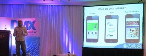
Going back to basics, Glenister said the term 'responsive' is used relatively loosely. While it is the solution to adaptive design, remember that responsive can be broken down further. In the email industry, Glenister says responsive is either simply scalable, fluid or truly responsive.
In taking these definitions further, Glenister explained that 'scalable' newsletter design is about taking a newsletter and proportionately scaling it down to fit the device, with all the content still showing. He says this isn't the best solution but it does have its place, and it's a good place to start to test the mobile waters and track engagement. This format only suits simple newsletter layout though with a single column, large fonts, and large call-to-action buttons as a tiny 'read more' that appears in the bottom right corner won't work.
Next up is fluid design, which is the editor's choice and where lots of bigger companies are already going. Glenister says this is often mistaken as responsive design. It builds on the scalable option by using 100% of the device's screen space from left to right, stacking the content, which lets the user have a fluid up and down scrolling motion to see all content. Because this takes scaling a step further, Glenister says it supports almost any layout, provided your newsletter design follows best practice and isn't a replication of the website design. Same as print doesn't translate to website.
![[DMX 2014] Is that really a responsive mobile newsletter design?](https://biz-file.com/c/1411/243503.jpg)
Finally we get to truly responsive design. Glenister says this again builds on the previous example of horizontal scrolling and stacking that works well, but the true magic comes in by reducing download speed on mobile, which is one of the biggest bugbears. This is done by minimising the amount of images shown and changing the colour of certain elements to create more contrast, as mobiles often used in conditions where the lighting's not great.
You can also alter content based on the device it's being opened on, as you as the marketer can't control the device your users use. Most segmentation is relatively simply by age, gender and race as these are static, but remember that you can't manage where your consumers live, so it's in segmentation that marketers often lose context. Glenister adds that there are some layout limitations, involved in implementing responsive newsletter design, so this is often suited best to a team with at least one dedicated 'design magician'.
Glenister ended by speaking of a Ted talk he watched by Rory Sutherland of Ogilvy on the importance of sweating the small stuff. You can view the talk below.
In summary of the Ted talk, Glenister picked up on two examples Sutherland shared - the first was in giving more options than seem obvious, such as adding the wow factor from tiny things like adding an extra bank of buttons in an office lift - the first is for the more obvious floor selection, the second could be to decide on the select style of music to listen to while travelling. Another example was of an aircraft-shaped salt and pepper shaker Sutherland coveted in an airline's first class lounge. On turning the shaker over, he noticed a sticker stating 'stolen from the first-class lounge'. Glenister explains that this shows the brands in question really know their customers and what makes them tick.
We are now at the point in technology where a great website alone isn't enough for the 'wow' factor. As technology's improved, so we get more conversions and engagement, so it's no longer a costly or time-consuming process as you can do it yourself. Glenister says the wow factor now lies in finding something small that stands out and nailing the little details but not including the little annoyances.
Two examples of these raised by the audience include allowing a link to open in a new tab instead of reloading in the current browser when clicked on, and doing constant testing across different handsets to mitigate the risk of the mobisite not looking great, or the common frustration of images not showing up in an email newsletter.
To test the effectiveness of your email newsletter design, Glenister recommends visiting Litmus.com and following the tips listed on EmailMonday.

